Browser-based ArchiMate® modelling tool — Version 0.9.0.2
1. Overview
Arkidor is a free browser-based ArchiMate® modelling tool supporting ArchiMate 3.2 and 4.0 — and it will stay free. No registration required. It runs entirely in your browser with no server or backend required. No data is saved to the server; all your models are stored locally in your browser. You can create, edit, and visualise enterprise architecture models using the full ArchiMate notation.
Key features
Completely free — no per-seat licensing, no trial, no paywall
No registration or sign-up required
Private by design — no data leaves your browser
Full ArchiMate 3.2 and 4.0 element and relationship palette
Multiple diagram views with tabs
Open and save ArchiMate Open Exchange Format XML files
Undo/redo with 50+ step history
Export diagrams to SVG and PNG
Drag-and-drop element placement
Find and replace across the model
2. Getting Started
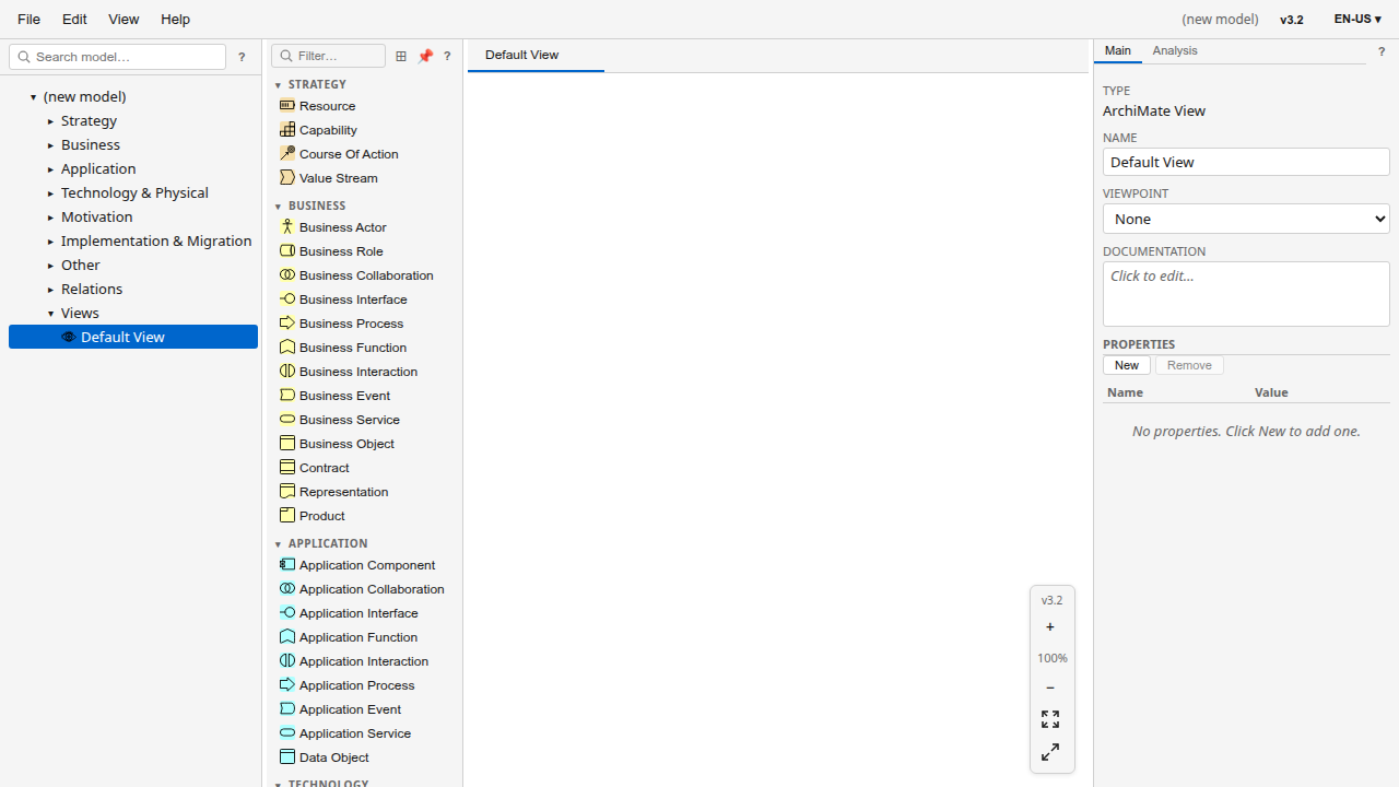
When you open Arkidor, a new empty model is created automatically with a Default View ready for editing.
Start modelling
Drag elements from the Palette panel onto the canvas.
Select an element to edit its properties in the Properties panel.
Save your work with Ctrl+S.
Create a new model
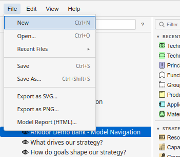
Go to File → New or press Ctrl+N.
A fresh empty model with a Default View opens.
Start adding elements from the Palette panel.
Open an existing model
Click Open File… or press Ctrl+O.
Select an ArchiMate Open Exchange Format XML file from your computer.
The model loads and the Navigator tree populates with all elements, relationships, and views.
You can also drag and drop an Open Exchange Format XML file directly onto the application window to open it.
3. The Interface
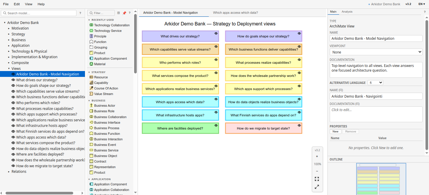
After opening a model, the interface shows four main areas:
Menu Bar (top) — File, Edit, View, and Help menus
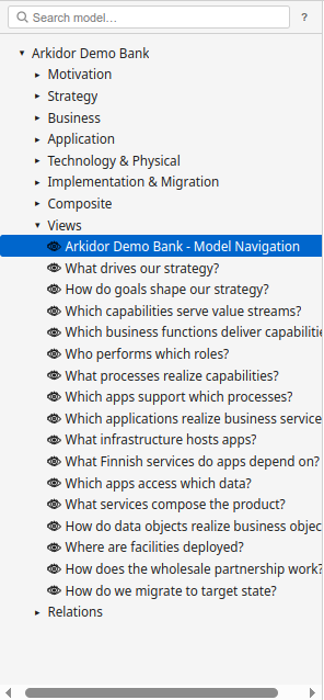
Navigator (left) — Tree view of your model's elements, relationships, and views
Canvas (centre) — Diagram area where you view and edit ArchiMate views
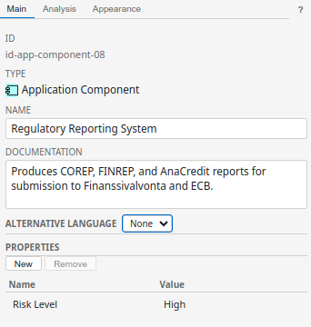
Properties Panel (right) — Edit attributes, appearance, and documentation for selected elements
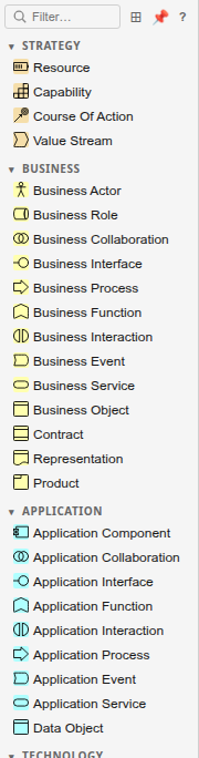
Palette (left, next to Navigator) — Element types you can drag onto the canvas
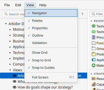
You can show or hide each panel from the View menu:
4. Working with Models
Saving your work
Press Ctrl+S or go to File → Save.
On first save, you'll be prompted to choose a file location.
Subsequent saves update the same file in place.
Use File → Save As… (Ctrl+Shift+S) to save a copy with a different name.
The unsaved changes indicator (●) appears next to the model name in the menu bar when you have modifications that haven't been saved yet.
Exporting diagrams
Open the view you want to export.
Go to File → Export as SVG… or Export as PNG…
The file downloads with the view's name.
Undo and redo
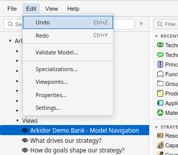
Ctrl+Z — Undo the last action
Ctrl+Y — Redo
Also available from Edit → Undo / Redo
5. The Canvas
The canvas is where you view and edit diagrams. Each open view appears as a tab at the top of the canvas area. Click a tab to switch between views, or close a tab to remove it from the workspace (the view remains in your model).
Navigation
Zoom in/out — Ctrl+= / Ctrl+-, or scroll wheel with Ctrl held
Pan — Hold middle mouse button and drag, or scroll wheel
Fit to window — Ctrl+Shift+F
Reset zoom — Ctrl+0
Adding elements
Select an element type from the Palette.
Click on the canvas to place it, or drag from the Palette directly onto the canvas.
The element appears and you can immediately type its name.
Connecting elements
Select the Magic Connector tool from the Palette, or hover over a source element to reveal its connection handle.
Drag from the source to the target element.
Choose the relationship type from the popup menu.
Editing element labels
Double-click an element on the canvas to edit its name.
Press Enter or click away to confirm.
Press Escape to cancel.
Context menu
Right-click on the canvas or an element to access contextual actions such as:
Delete element
Rename
Select connected elements
Align and distribute
Change appearance
6. The Palette
The Palette panel lists all ArchiMate element types organised by layer (Strategy, Business, Application, Technology, etc.) and all relationship types.
Using the Palette
Drag and drop — Drag any element type from the Palette onto the canvas to create an instance.
Click to activate — Click an element type to activate the placement tool, then click on the canvas to place it.
Sticky mode — Double-click a palette item to place multiple elements of the same type. Press Escape to deactivate.
Search — Type in the search box at the top to filter element types.
The Palette respects the active view's viewpoint. Elements not allowed in the current viewpoint appear greyed out.
7. The Navigator
The Navigator shows the model's complete structure as a tree.
Navigating the model
Expand/collapse — Click the arrow next to a folder to expand or collapse it.
Open a view — Double-click a view to open it on the canvas.
Select an element — Click an element to select it and show its properties.
Drag to canvas — Drag an element from the Navigator onto the canvas to add it to the current view.
Organising elements
Drag elements between folders to reorganise your model.
Right-click a folder to create new sub-folders or elements.
Press F2 to rename the selected item.
Search
Use Ctrl+F to open Find & Replace, which searches across all element and view names in the model.
Selecting an element in the Navigator shows the Main and Analysis tabs in the Properties panel. To access the Appearance tab (colours, fonts, size), select the element on the canvas instead.
8. The Properties Panel
The Properties panel appears on the right side of the interface. It is context-sensitive — the tabs and fields it shows depend on what you have selected.
Tab bar
The panel shows up to three tabs depending on the selection context:
Main — Always present. Shows identity, naming, documentation, and properties for the selected object.
Analysis — Appears for elements, relationships, views, and folders. Shows where the selected object is used and how it connects to other objects.
Appearance — Appears only when an element or connection is selected on the canvas (not in the Navigator). Controls visual styling.
Main tab — Elements
When you select an element, the Main tab shows:
ID — The element's unique identifier (read-only).
Type — The ArchiMate element type with its icon (read-only).
Name — Editable text field for the element name.
Specialization — Dropdown to assign a specialization (only appears when specializations are defined for this type). An ℹ️ button shows the specialization's documentation if available.
Documentation — Multi-line text field for free-text documentation.
Alternate languages — If your model has multiple languages, expandable fields show the name and documentation in each language.
Specialization Attributes — If the assigned specialization defines typed attributes, additional input fields appear here.
Properties — Key-value pairs (see User Properties below).
Main tab — Relationships
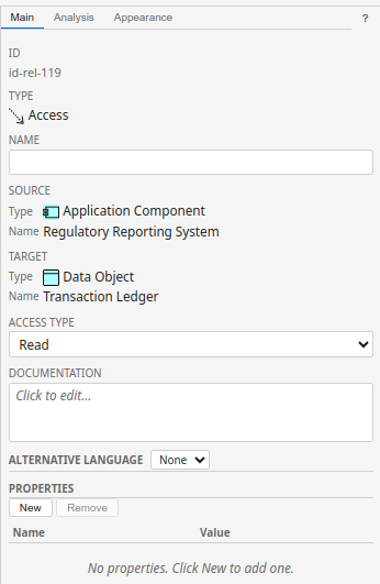
When you select a relationship (on the canvas or in the Navigator), the Main tab shows:
ID — Unique identifier (read-only).
Type — The relationship type with its icon.
Name — Editable name field (optional for most relationship types).
Source — Shows the source element's type (with icon) and name. You can double-click the name to navigate to it. Drag the source row onto the canvas to add it to the current view.
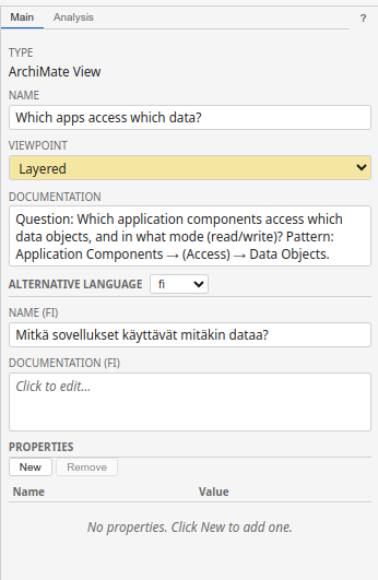
When you select a view (by clicking its tab or selecting it in the Navigator), the Main tab shows:
Type — Always "ArchiMate View".
Name — Editable view name.
Viewpoint — Dropdown to assign a predefined or custom viewpoint. The dropdown background colour indicates the viewpoint category.
Documentation — Multi-line text field.
Alternate languages — Name and documentation in other languages.
Main tab — Model root
Click the model name at the top of the Navigator tree to see:
Type — "ArchiMate Model".
Name — The model name.
ArchiMate Version — Switch between 3.2 and 4.0 (triggers the Migration dialog).
Purpose — Multi-line field for the model's purpose statement.
Documentation — Multi-line documentation.
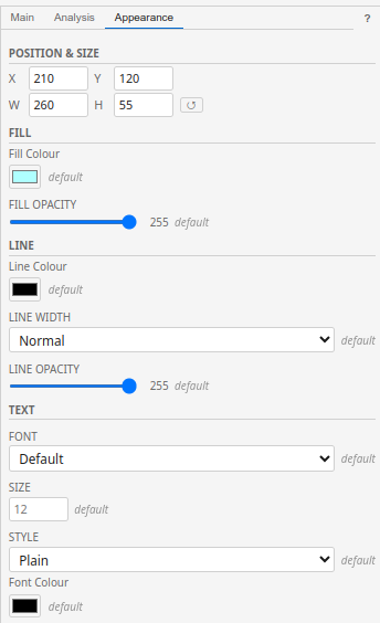
Appearance tab
The Appearance tab is only available when an element or connection is selected on the canvas (it does not appear for Navigator-only selections).
For elements (nodes):
Position & Size — X, Y coordinates and W, H dimensions as numeric inputs. A reset button restores the default size.
Fill — Colour picker and opacity slider (0–255). Reset returns to the type's default colour.
Line — Colour picker, line width (Normal / Medium / Heavy), and opacity slider.
Text — Font family (Arial, Courier New, Georgia, Segoe UI, Times New Roman, Verdana, or Default), font size, style (Plain / Bold / Italic / Bold Italic), and font colour.
For connections:
Line — Colour, width, and opacity (same as for nodes).
Text — Font family, size, style, and colour.
Each field shows a default badge when using the default value, or a ↺ reset button when customised.
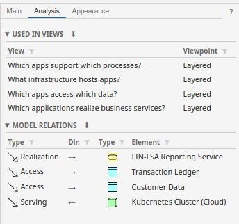
Analysis tab
The Analysis tab shows how the selected object is used across your model. Its content varies by selection type.
For elements and relationships:
Used in Views (collapsible) — A table listing every view that contains this element. Columns: View name, Viewpoint. Double-click a row to open that view and select the element on the canvas.
Model Relations (collapsible, elements only) — A table listing all relationships connected to this element. Columns: Relationship type (with icon), Direction (→ outgoing / ← incoming), Element type (icon), Element name.
For views:
Elements (collapsible) — All elements in the view, with type icon and name.
Connections (collapsible) — All connections in the view, showing source → type → target.
For folders:
Elements, Relations, and Views — Catalogues of the folder's contents.
All Analysis tables support:
Column sorting — Click a column header to sort ascending/descending.
Filtering — Click the filter icon to reveal filter inputs for each column.
CSV export — Click the ⬇ button in the section header to download the table as a CSV file.
Drag to canvas — Drag any row onto the canvas to add that element or relationship to the current view.
Double-click an element name in the Model Relations table to navigate to that element on the canvas.
User Properties
The Properties section appears at the bottom of the Main tab for elements, relationships, and views. It lets you add custom key-value pairs that are preserved in the Open Exchange Format file.
Select an element and scroll to the Properties section at the bottom of the Main tab.
Click the + button to add a new property.
Enter a key (name) and value. The key field offers auto-complete suggestions from property keys used elsewhere in your model.
To remove a property, click the × button next to it.
If a property value looks like a URL (starts with http:// or https://), it is displayed as a clickable link.
9. Viewpoints
Viewpoints restrict which ArchiMate element types can be used in a view. They help you focus on a specific concern or stakeholder perspective.
Applying a viewpoint
Select a view (click its tab or select it in the Navigator).
In the Properties panel, find the Viewpoint dropdown.
Choose a viewpoint from the list.
The Palette updates to show only allowed element types — disallowed types appear greyed out.
Custom viewpoints
You can create your own viewpoints to match your organisation's needs:
Go to Edit → Viewpoints…
Click New to create a custom viewpoint.
Give it a name and select which element types to allow.
Click Save.
Custom viewpoints appear alongside the predefined ArchiMate viewpoints in the viewpoint dropdown.
To see all predefined ArchiMate viewpoints and their allowed types, expand the Predefined section in the Viewpoints manager.
10. Specializations
Specializations let you create subtypes of ArchiMate elements with custom icons and colours. For example, you might create a "Microservice" specialization of the Application Component type.
Managing specializations
Go to Edit → Specializations…
Click New to create a specialization.
Choose the base ArchiMate concept type (e.g., Application Component).
Enter a name for the specialization.
Optionally set a custom colour and icon.
Click Save.
Using specializations
Once defined, specializations appear in the Properties panel when you select an element of the matching base type. Choose the specialization from the Specialization dropdown in the Main tab.
Specialization attributes
When creating a specialization, you can define custom typed attributes (e.g., "SLA Level", "Cost Centre"). These appear as additional input fields in the Main tab whenever an element has that specialization assigned. Attribute values are stored as element properties in the Open Exchange Format file.
ArchiMate 4.0 preset specializations provide backward compatibility with element types that were reorganised in the 4.0 specification. Do not delete these unless you know your model does not use them.
11. Model Validation
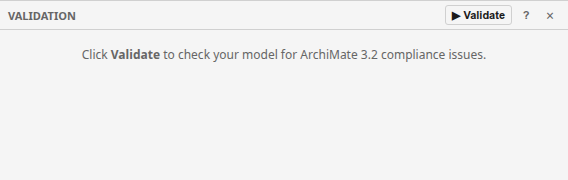
The validation panel checks your model for compliance issues — invalid relationships, orphaned elements, incorrect nesting, and more.
Running validation
Open the Validation panel from View → Validation.
Click the ▶ Validate button.
Issues appear grouped by severity: errors, warnings, and informational messages.
Click an issue to select the affected element on the canvas.
Issue types
Invalid relationships — A relationship that is not permitted between the source and target element types per the ArchiMate specification.
Orphaned elements — Elements that exist in the model but are not used in any view.
Invalid nesting — Elements nested inside containers where the nesting relationship is not valid.
Duplicate IDs — Multiple elements sharing the same identifier (typically caused by file corruption).
Export validation results to CSV using the download button in the panel header for reporting or tracking.
12. Multi-Language Support
Arkidor supports models with element names and documentation in multiple languages. Each element can have a primary name and alternate language variants.
Setting the working language
Click the language badge in the top-right of the menu bar (e.g., EN ▾).
Select a language from the quick-switch dropdown.
The canvas and Navigator update to display names in the selected language.
Managing languages
Click the language badge and select Manage Languages…
Add new languages, remove unused ones, or reorder your preference.
The first language in the list is your primary working language.
Adding translations
Select an element in the Navigator or canvas.
In the Properties panel's Main tab, alternate language fields appear below the Documentation field — one name and documentation field per language.
Enter the translated name and documentation for each language.
When a translation is missing for the active language, the element shows a language badge (e.g., "(en)") indicating which language's text is being displayed as a fallback.
13. Model Report Export
Generate a comprehensive HTML report of your entire model, including views rendered as SVG diagrams, element catalogues, and relationship inventories.
Generating a report
Go to File → Model Report… (requires a model to be open).
Select which sections to include:
Cover page with model statistics
Table of contents
Model summary
Element and relationship inventories per view
Full element and relationship catalogues
Viewpoint appendix
Click Export. The report downloads as an HTML file.
The model report is self-contained HTML — open it in any browser, print to PDF, or share directly with stakeholders.
13a. ArchiMate Version Migration
Arkidor supports both ArchiMate 3.2 and ArchiMate 4.0 models. You can migrate a model between versions.
Upgrading from 3.2 to 4.0
Click the version badge in the menu bar (e.g., v3.2).
The Migration dialog opens showing what will change:
Layer-based organisation becomes domain-based
Some element types are reorganised or renamed
Preset specializations are added for backward compatibility
Review the type mappings and colour changes.
Click Upgrade to apply the migration.
Downgrading from 4.0 to 3.2
Click the version badge (v4.0) in the menu bar.
Review the downgrade summary — some v4-specific types will be mapped back to their v3 equivalents.
Click Downgrade to apply.
Migration is a significant operation. Use Ctrl+Z to undo if the result is not what you expected. It is recommended to save a backup before migrating.
13b. Connection Routing & Appearance
Connections between elements on the canvas use orthogonal (right-angle) routing by default. You can adjust their appearance and manually add bendpoints.
Adjusting connection appearance
Select a connection on the canvas.
In the Properties panel, switch to the Appearance tab.
Adjust line colour, line width, and opacity.
Adding bendpoints
Click on a connection segment to select it.
Drag the blue handle that appears mid-segment to create a bendpoint.
Drag an existing bendpoint to reposition it.
Right-click a bendpoint and select Remove Bendpoint to delete it.
Use Edit → Straighten Connections (or right-click → Straighten) to automatically clean up unnecessary bendpoints on selected connections.
14. Getting Help
Arkidor provides several ways to access help while you work.
Contextual help (F1)
Press F1 at any time to open the user manual in a new browser tab. The manual opens at the section relevant to what you're currently working on:
F1 with the Palette focused → opens the Palette section
F1 with the Navigator focused → opens the Navigator section
F1 with the Properties Panel focused → opens the Properties section
F1 with the Canvas focused → opens the Canvas section
F1 with no specific panel → opens the manual at the top
Help icon buttons
Each panel has a small ? button in its header. Click it to open the manual at the section for that panel.
Help menu
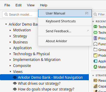
The Help menu provides:
User Manual — Opens this manual (same as F1)
Keyboard Shortcuts — Opens the shortcuts reference section
Send Feedback… — Opens the feedback form to report issues or suggest improvements
About Arkidor — Shows version and copyright information
15. Keyboard Shortcuts
Action
Shortcut
New model
Ctrl+N
Open file
Ctrl+O
Save
Ctrl+S
Save As
Ctrl+Shift+S
Undo
Ctrl+Z
Redo
Ctrl+Y
Find & Replace
Ctrl+F
Delete selected
Delete
Select all
Ctrl+A
Zoom in
Ctrl+=
Zoom out
Ctrl+-
Fit to window
Ctrl+Shift+F
Reset zoom (100%)
Ctrl+0
Full screen
F11
Rename selected
F2
Contextual help
F1
16. Tips & Troubleshooting
Tips
Hold Ctrl or Alt while dropping an element from the Navigator to suppress automatic connection creation.
Use the Outline minimap (View → Outline) to navigate large diagrams quickly.
Enable Snap to Grid or Snap to Guides from the View menu for precise element placement.
Drag an element from the Navigator onto the canvas to reuse an existing element in the current view (rather than creating a new one).
Double-click a palette item to enable sticky mode — place multiple elements of the same type without re-selecting. Press Escape to deactivate.
Use Edit → CSV Import/Export to bulk import or export elements and relationships as spreadsheet data.
Auto-save runs automatically every 5 seconds when you have unsaved changes. If the browser crashes, you'll be offered to restore your work on next launch.
Press F1 while working in any panel to jump directly to the relevant section in this manual.
Troubleshooting
Problem
Solution
File won't open
Ensure the file is a valid ArchiMate Open Exchange Format XML file (not a binary .archimate file from older Archi versions).
Save isn't working
In Firefox, use Save As (download) since the File System Access API isn't supported. Chrome and Edge support in-place save.
Diagram appears blank
Double-click a view in the Navigator to open it. The canvas is empty until you open a specific view.
Elements are greyed out in Palette
The active view has a viewpoint set that restricts which element types can be used. Change the viewpoint in the view's properties or switch to a view without a viewpoint.